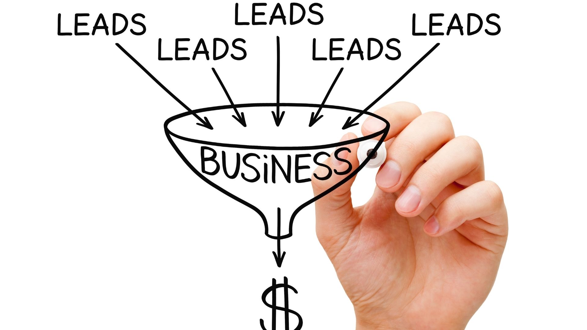
A good landing page can be your make or break. They’ll bounce if it doesn’t engage your audience on their first look. After all, landing pages are one of the most effective ways to convince your audience to make that final purchase – or to consider it!
This post shares valuable tips to help you design the highest converting landing page with a good user experience and interface.
The essential elements of landing pages that convert
A landing page is an independent web page created for a specific growth marketing campaign. Its primary purpose is to persuade visitors to perform a particular action and convert them into leads. To create a landing page that converts at a high rate, it should have the following elements:
Headlines
Headlines are crucial for the initial landing page engagement. Visitors should be able to tell the value of offerings by viewing your headline, and that’s why a killer heading and subheadings are so important.
Your headlines should immediately capture your target users’ attention and spark their interest to view the landing page further. Organizing your on-page content with subheadings is also crucial for readers who want to scan your page to find what they’re looking for.

Your USP
Developing a clear and relevant value proposition is the next thing you need to do to make your landing page impactful. Your unique selling proposition should be evident throughout the page, from the headline to the ad copy and submit button. This way, users know what they are getting themselves into when they decide to engage your brand.
Your USP is like your brand promise to your customers. It tells them what to expect from your brand and the benefit they get from choosing your services. Trello does an excellent job highlighting its USP in its headline and copy.
Figure 1: Trello’s landing page. Source – Trello
A clean, clear layout
Your landing page should have a user-friendly design to boost engagement. It should have a simple design and not be stuffed with a lot of information and pop-ups that can annoy your visitors.
The text should be in a legible color; otherwise, it won’t get read. Keep the sentences short and to the point to encourage comprehension. The paragraphs should be small and easily digestible to ensure readers don’t get lost in the middle. Your CTA should be obvious, and there should be a natural flow that builds the visitor’s psychological motivation till they get to the conversion stage.
Convincing copy
Your landing page copy should be short and actionable to increase conversions. The bounce rates increase when a landing page has many words, so ensure the copy is brief and to the point.
Another thing to consider when crafting your landing page copy is to ensure it evokes the emotion of your readers. Your audience wants to know how their lives will change when they buy your products, and that’s what you should concentrate on now. Use trigger words to entice action and drive most of your leads to conversion.
Clear audience benefits
Don’t use your landing page to promote your product features. Instead, use it to share the benefits users can expect when they buy your offering. Tell them how they will feel when they buy your products and how their lives will get better.
By clearly stating the audience benefits, you encourage visitors to click the CTA to learn more about your products.

Creatives
A landing page with only text is boring. Using creatives increases engagement and conversions as they make people spend more time on your landing page.
Videos and images make your marketing messages more effective by making it easier for viewers to understand your offering. A study by Insivia Technologies found that videos increase conversions on landing pages by 80 percent, so make sure to add them to your campaign page when you want people to perform a certain action.
Social proof
Add customer testimonials on your landing page to get people to trust your brand. Growth marketing is all about trust, and testimonials give you the needed social proof to persuade visitors to choose your company.
Whatagraph shares client reviews and integrates the review sites on their landing page as social proof.
Figure 2: Whatagraph social proof. Source – Whatagraph
A call to action
Your landing page serves no purpose if it doesn’t have a CTA. So add a clear and relevant CTA to guide users on the action they should take next.
“Learn more,” “Start free trial,” “Book Now” are just a couple of the CTAs you can add to your landing page.
No external links
Your landing page’s only goal is to convert visitors to leads. As such, you shouldn’t include any other links that can distract your visitors from this goal. Likewise, avoid landing page redirects, unless they are shareable links to social media, for example, which should open in a separate tab.

How to build an incredible landing page
These tips will guide you on how to make a landing page that will help you build customer loyalty and boost conversion rates.
Define your pages’ goals
Before you begin the design process, you need to determine the goals of your page. For example, do you want to use the landing page for advertising your products, or do you need it to collect customer contacts for your mailing list? Clearly defining your goals will guide you in deploying landing page optimization techniques to achieve the desired impact.
Know how to tailor your page to your audience’s interests, wants, and needs
Be mindful of your audience when coming up with your landing page design. Take a moment to understand their needs and interests to ensure your landing page is relevant to them.
Create several landing pages for each audience if you have multiple customer segments. Don’t use a generic design and messaging for your landing page, as this could see you alienating the same people you’re trying to attract.

Develop powerful copy that is actionable and audio-focused
Your landing page will only be effective when it includes clever copy that’s actionable and relevant to your users. Your headline should instantly grab the attention of your visitors when they get to the page.
Give descriptive product information in the body to make it easy for readers to understand your offering. Instill a sense of urgency in your copy to encourage action and include your USP to differentiate your products from others in the market.
Design your CTA to stand out and persuade your audience
The call to action is one of the most critical elements of a landing page. Everything on a landing page is designed to drive users’ attention to this point, so you should do everything possible to make your CTA memorable.
Your CTA should be bigger than other buttons on the page to ensure visitors aren’t confused about which button to press to progress further in the conversion funnel. The CTA copy should also be compelling to encourage visitors to click it. Finally, use a contrasting color to ensure the CTA stands out on the page.
Note that you should test different elements like the copy, color, and design to find the best-performing variants before settling on the final design. Work with a growth marketing agency to perform A/B tests on your CTA elements before launching your campaign.
Choose the most compelling creatives
Visual elements are a vital component of landing pages that work. The brain processes visuals 60,000 times faster than text, meaning the images and creatives will positively impact your visitors on your landing page.
When choosing creatives, make sure they are relevant to your brand. The visuals should also be high-quality to grab the attention of your visitors and demonstrate the value of your product or service.
Know how to layout your page
Another vital element of landing pages that work is an impressive layout. The elements on your landing page should be well arranged to ensure visitors are engaged until they get to the CTA.
Have a compelling headline and use images in the copy to emphasize your message. Position your CTA button next to the “magic moment” to boost conversion rates. This could be after describing the features that make your product better than what’s available to users.
Don’t be afraid to share reviews
Reviews are one of the most effective growth marketing solutions you can use to gain the trust of your customers. Online shoppers trust online reviews just as much as personal recommendations. So adding your top customer testimonials on your landing page can help you persuade shoppers to commit to your business.
Publish positive feedback from your customers alongside the products they’ve purchased to promote your brand and nudge potential customers to make a buy.

If you’re launching a new product or service, you need a good landing page. The team at Growth Marketing Genie can help you design the highest converting landing page to ensure you turn most of your leads to paying customers.

Book in a Free Consultation
